- This topic is empty.
-
AuthorPosts
-
-
November 11, 2013 at 7:33 am #15720
K.Campbell
MemberHoping to get as many people to see my work and give me their opinions on it.
What do you like? dislike? Would you wear it? Constructive criticism welcome!!Instagram: @phwankenstein http://instagram.com/phwankenstein
Deviantart: http://blobsnsquiggles.deviantart.com/
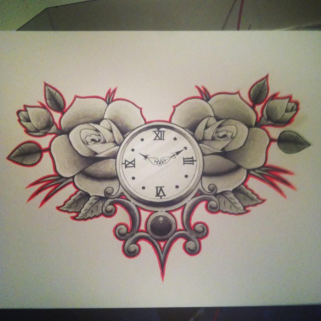
-Timepiece & Roses
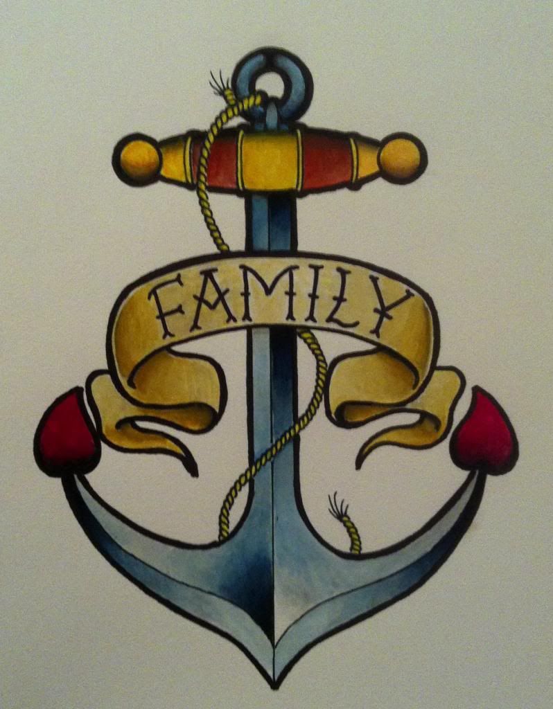
-Anchor
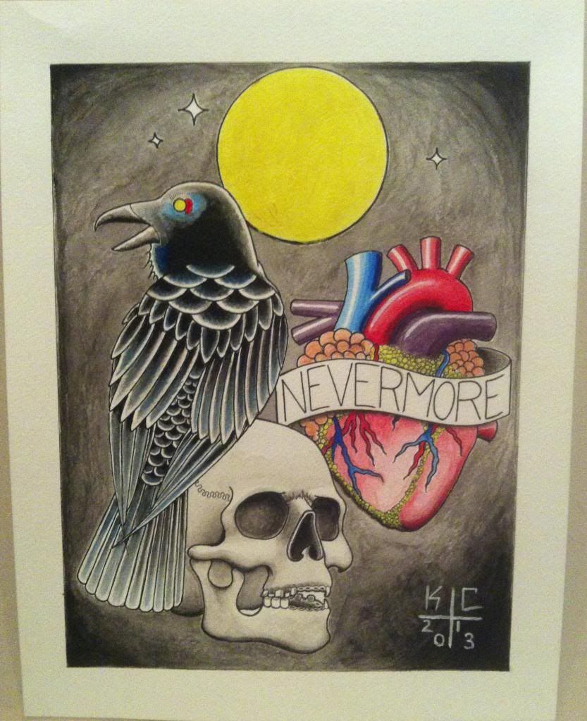
-The Raven
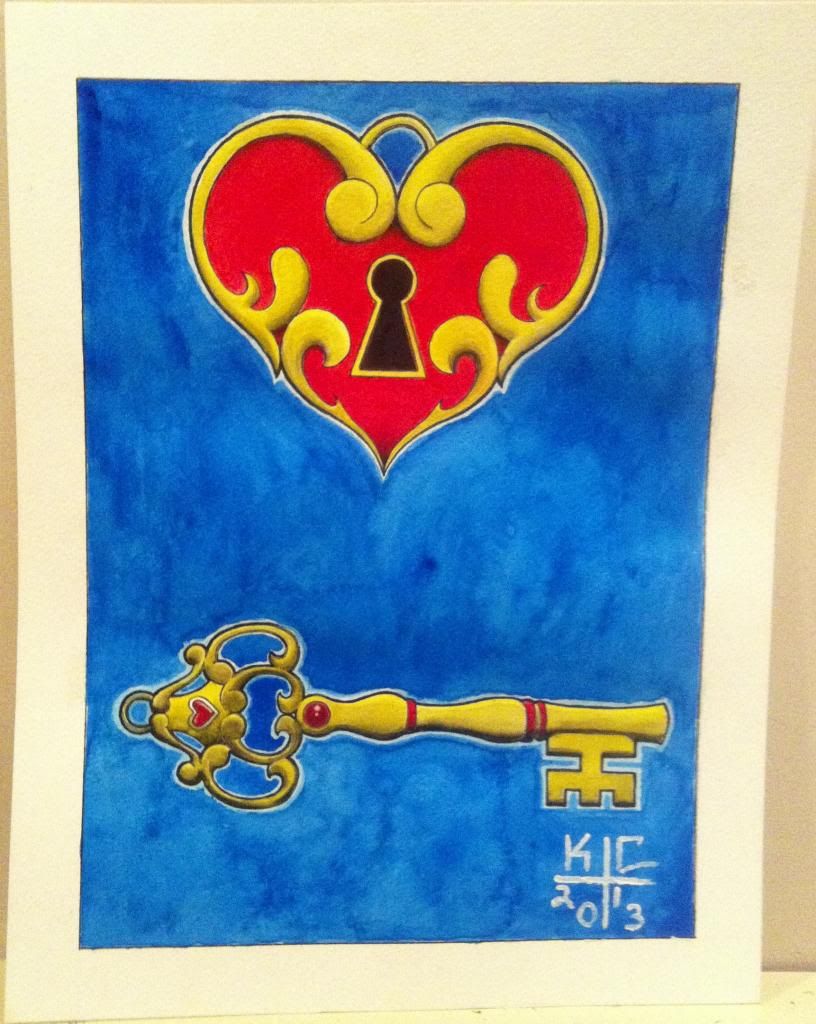
-Heart Lock & Key
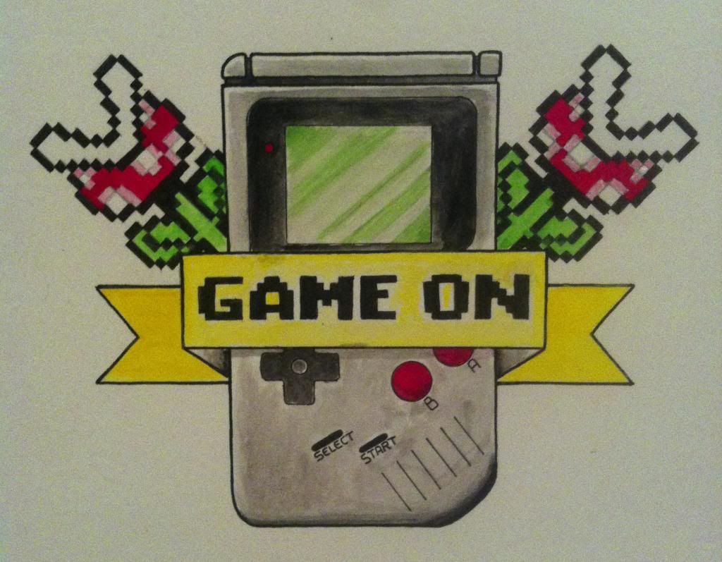
-Game On
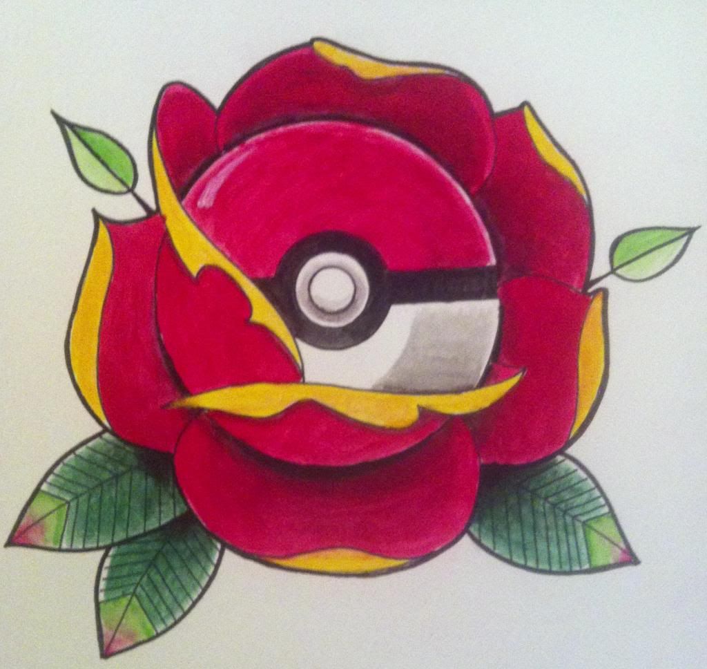
-Pokerose
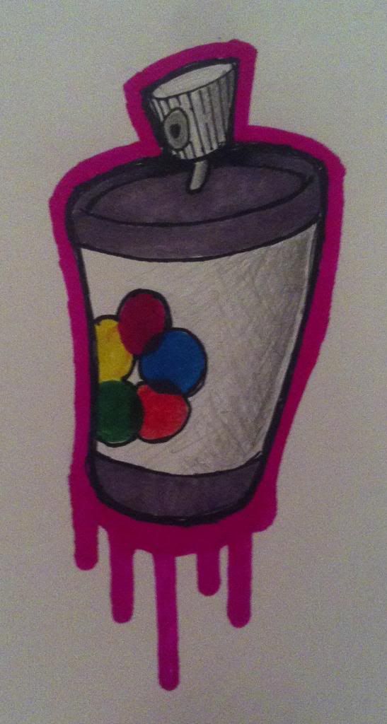
-Spraycan
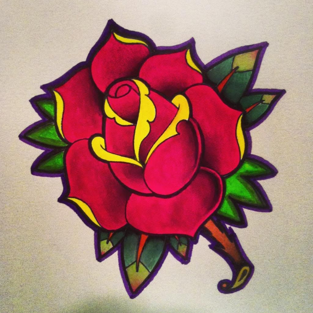
-Rose
-Crow
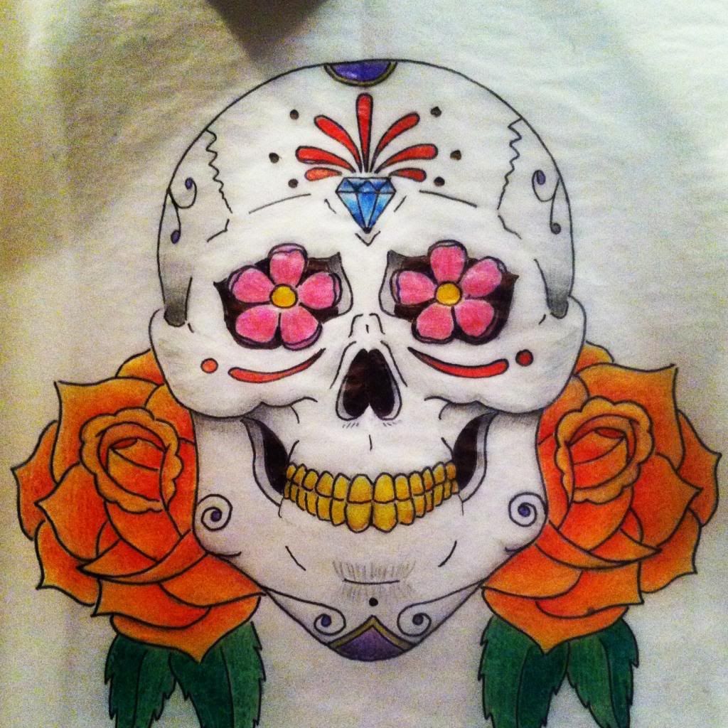
-Sugar skull
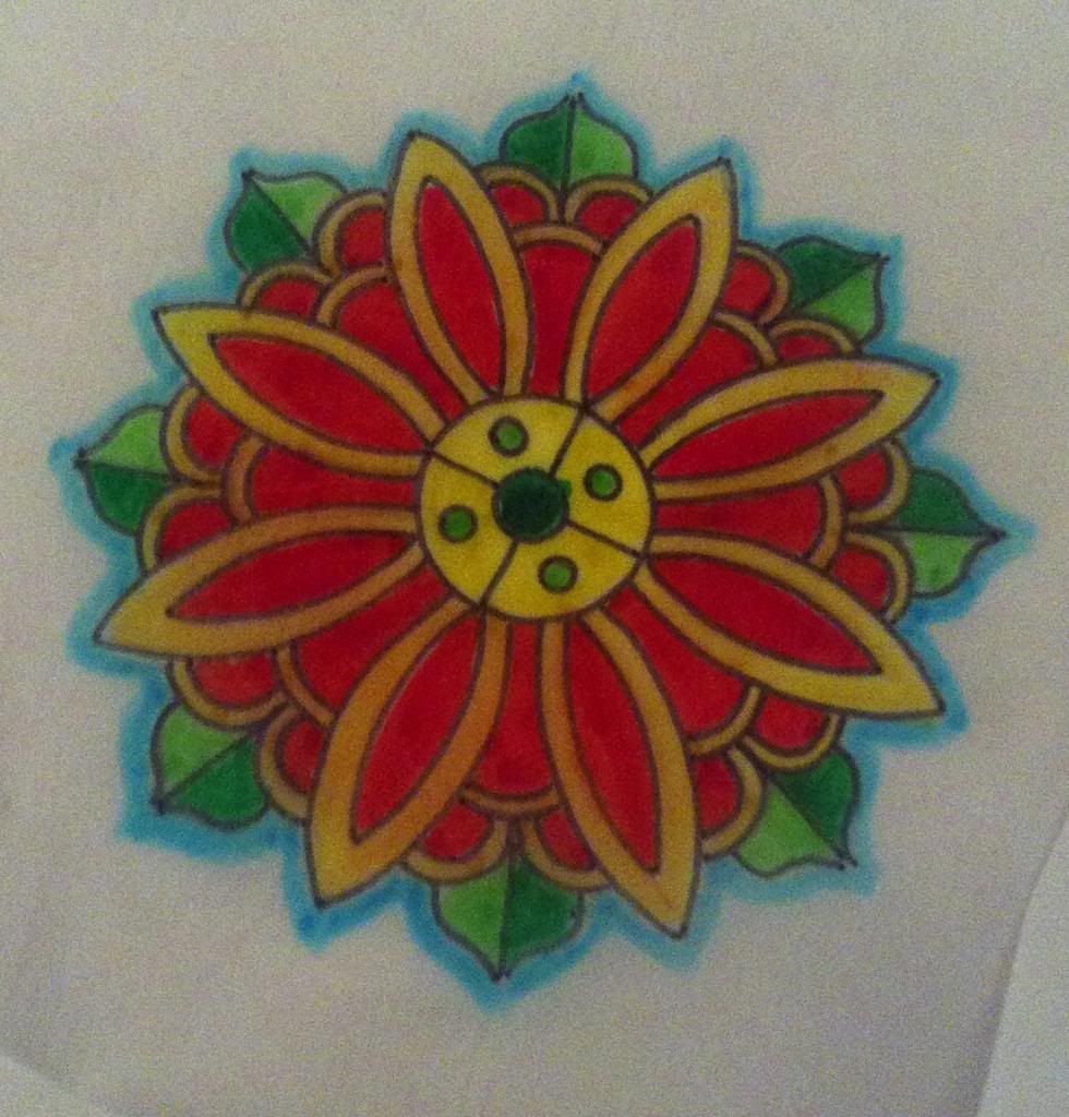
-Mandala
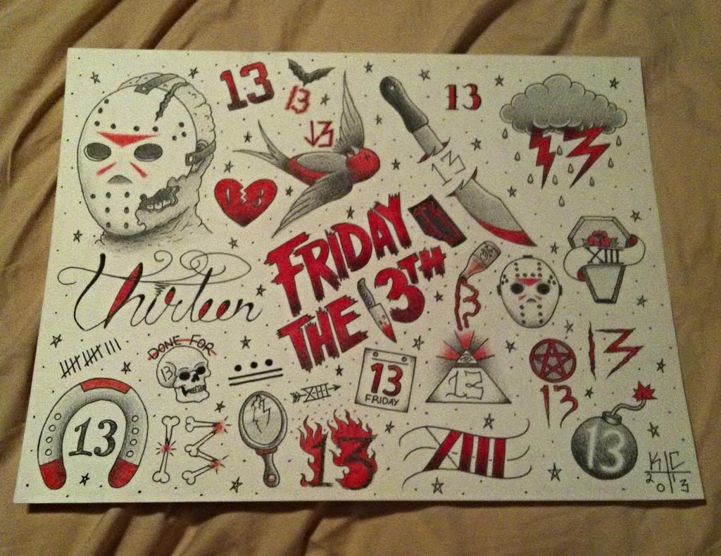
-Friday the 13th
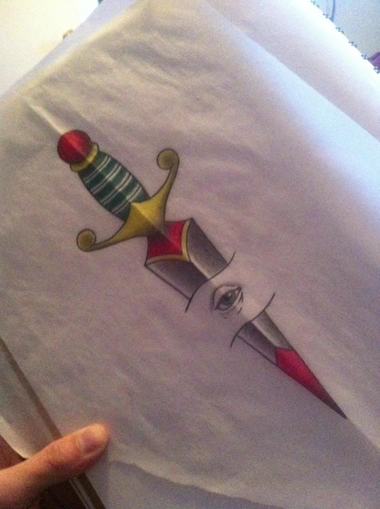
-Daggeye
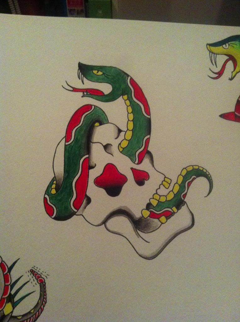
-Skull & Snake
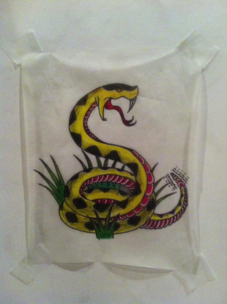
-Rattler
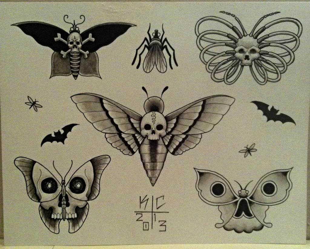
-Deathmoths
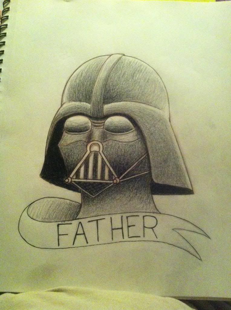
-Father -
November 15, 2013 at 7:12 pm #26551
robroy289
Participanti like them all very much.. what are you using other than color pencils? Water colors? The time piece and rose is very nice. The anchor is very clean and is something i would get tatted. The raven is very good but i do not like the heart however it dosent fit the scene, maybe went a little darker with the heart i don’t know but it is a bad ass piece until the heart. The heart and key done really well but could have used come more color blending in the background maybe a dark to light blue. Game on is nice. The poke-rose is unique and i like it being that i have always like Pokemon. Spray can is cool. Love the old school rose. Crow is good. Now the sugar skull is done very well and good color and detail but, he looks to be a little over weight! Lol! Mandela good. I absolutely love the Friday 13th flash sheet!! I would hang that in my shop!! Daggeye is really good with great color. Classic Ed Hardy style snake and skull done very well! Love the color in the rattler!! Dead moths flash sheet is awesome and again would be something i would hang in my shop. Father is awesome!!! You are a very good artist!!!
-
November 29, 2013 at 9:40 pm #26552Member
Thanks Robroy!
I use watercolor paints & pencils, color pencils, markers & graphite on any of the works I’ve posted above. I think you echoed a lot of things I already feel about my artworks; I feel strongly about the ones you liked a lot & didn’t feel as confident about the ones you mentioned you saw problems with. I definitely agree about the sugar skull looking overweight lol, I drew that piece a few years ago and I’ve learned to draw skulls a bit better. The raven was a hard piece for me and the heart was a bit of an add-on, I think that may be why it doesn’t fit in the piece as well or maybe the color choices could have been better. But once again, thank you for taking the time to look and give me an honest critique on my work :)
Kyle
-
December 1, 2013 at 5:03 am #26553Participant
You are welcome and keep up the great work!!
-
December 1, 2013 at 9:30 am #26554
Retsaw
MemberI personally like the friday 13th sketches, rest seems pretty much copied or not impressive because lack of your own touch in it.. keep up the work tho, dedication is the key, also biggest tip i can give to you is, observe styles more closely and try to turn it to your own, do not aim for perfect imitation or print steal to “learn”, learning comes when you actually can do it all by yourself and by your own imagination.
-
December 1, 2013 at 11:43 pm #26555Member
I can see where a lot of the work would seem copied, as when putting a lot of the flash together I tried to stick to traditional themes and used references. Although there are similarities to a lot of other tattoos, I wouldn’t say I “print stole”. I still have a lot of learning to do and am currently taking classes at an art school to improve my drawing & design fundamentals.
-
December 2, 2013 at 9:49 am #26556Member
Well you should try to build up composition with oldschool ones, the too minimalistic ones are the ones you need to keep yourself, because they show no artistic value if you post them here, they are rather importance of basic fundamental of showing ability to do simpler stuff also, in portfolio ofcourse. I’d like to see more full pagers like friday13 sketches, or some more built up composition of different elements, like snakes, roses, skull heads and stuff, in my honest opinion you’re not doing bad at all, but those are things i’m pointing out what come more useful for your artistic progress also.. i’m not anykind of good level artist in this manner, but i have seen a’lot and i have learned a’lot to have a valid opinion not just subjective, also try to use more firm outline for sketches what stands out more for the oldschool style tattoos, coloring either water color, filt pens or casual color pencils with little help of filt pens in darker shade areas, this works well by combining all them together if you are like me, with poor sketching equipment ;)!
-
December 3, 2013 at 6:06 am #26557Member
Thanks for your honest opinion, I will definitely take that into consideration for the future. I’ve already been working towards filling the page more when I do flash, but I don’t have anything I want to share just yet. I’ll have more pics soon :)
-
-
AuthorPosts
- You must be logged in to reply to this topic.
Recent Comments