- This topic is empty.
-
AuthorPosts
-
-
August 26, 2013 at 2:08 pm #15574
Buller
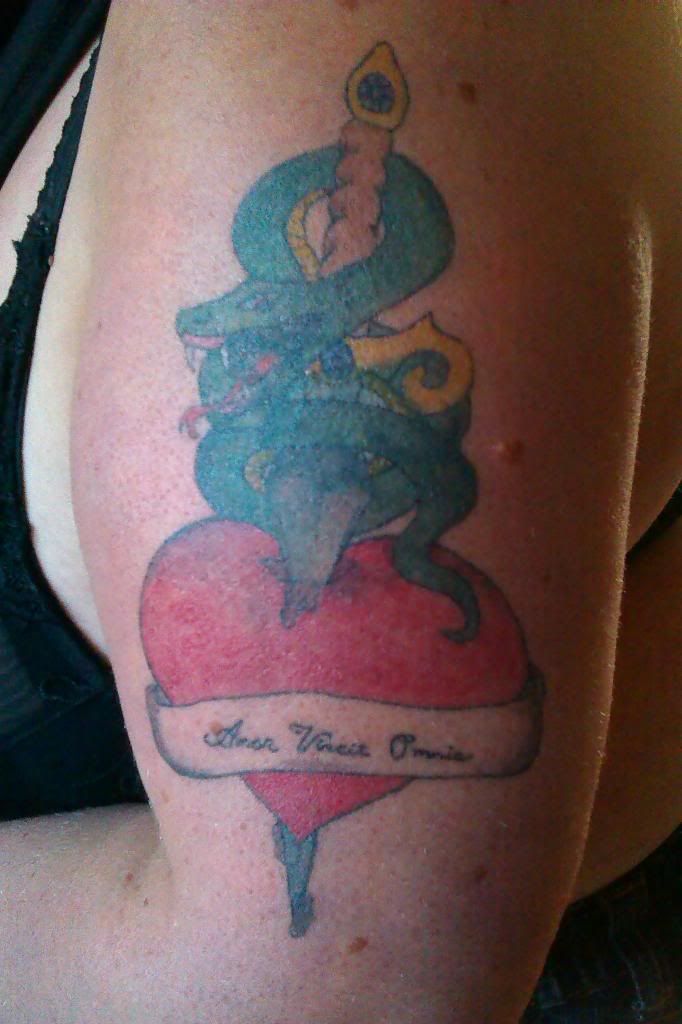
MemberThis is my second on skin. A cover up… Let me know what you think..
Before: http://i1361.photobucket.com/albums/r664/BullerBaz/2013-03-25201612_zps547ec8df.jpgAfter: http://i1361.photobucket.com/albums/r664/BullerBaz/2013-08-15234735_zps36e00047.jpg
-
August 26, 2013 at 2:30 pm #25562
brokenpipe
MemberPicture is blurry on my phone. Did u draw it on or use a stencil?
-
August 26, 2013 at 2:33 pm #25563
Buller
MemberI used a stencil. :)
-
August 26, 2013 at 3:39 pm #25564
Lennart82
ParticipantIt looks decent enough, though the dolphin is kind of blurry.
Any chance of some closeups? -
August 26, 2013 at 3:41 pm #25565
Ramenuzumaki
Participantvery hard to see either of the photos D:
-
August 26, 2013 at 4:35 pm #25566
Buller
Member -
August 26, 2013 at 5:38 pm #25567
Ramenuzumaki
Participant -
August 26, 2013 at 7:03 pm #25568
Buller
MemberOk :) . The dolphin was a bit blurry and made of a pro, but my wife was tired of the blurry look and wanted it covered.
-
August 26, 2013 at 7:19 pm #25569
Buller
Member -
August 27, 2013 at 1:11 am #25570
Ramenuzumaki
Participantgood job dude
Really great colour saturation
did you draw the design? -
August 27, 2013 at 1:29 am #25571
Infamous
ParticipantNice coverup
-
August 27, 2013 at 6:26 am #25573
Buller
MemberThanks guys. :D great confidence boost. Ya it may need a recolouring to cover up the dolphin. Yes its my own drawing + some of my wifes ideas. But maybe a bit hard, trying to do a cover up, when im just a novice… (sorry for my spelling. Im danish)
-
August 27, 2013 at 6:29 am #25574
Lennart82
ParticipantAhhhh, its a cover up :D Missed that one
In that case, its a good cover up.BUT…. (now the bad part… You will get the beating . . . not deserved, but the one you need)
The writing… Not good. To small to even read. And the position of it… All twisted and not in a corved line.
You did use a stencil on the writting??? It really dosent looks like you did. Be very carefull with lettering, I cant express this enough. Its whats separate the lions from the sheeps. It gives that little extra edge from others. And as you are from Denmark, and I am as well, I do believe you know and have seen too many damn poor tattoos done in every corner of every city, dont rush your game, dont be like them.
Take your time with letters, and breathe deep. You want them perfect. ;) When practising doing letters, do it on fruit. NEVER on practise skin (The reason is, you will never tattoo letters on a totally flat surface on human skin, use the curves from fruit to give you the practise)The ribbon… Looks too bare, imo. When everything else has a colour, and the ribbon just is bare flesh more or less. You should have gone with the colour you did on the knife handel. Just to give it an overall colour plate. The final touch to bind the piece together.
The lines… Okey the heart is quite good, no remarkable wobbely lines. Kuddos on that. But there are planty of places were you need to pace your self, and breathe deeply.
Now Back To The Good Part. ;)
Your colours are good. Agreed with Ram on this its a good saturation you got going there. You clearly have some unpolished skills when it comes to colours. Polish that, make that shine. ;)Hope I didnt sound too much of a douche here. It was only ment for a helping hand. And as Ram once said; Don’t tell people their good, when they are not. That will not help them.
And I agree to that. :mrgreen: -
August 27, 2013 at 7:19 am #25572
Buller
MemberThanks Lenn. No its great to get some constructive critique. The only way to get better. It still needs some touch up when its healed up. The lettering should have been bigger and maybe a larger needel. Yes i have seen a lot of crappy work, done by pro’s and scratchers. But nice to know if i should keep on doing this or throw out the mashine and forget it. :D
-
August 27, 2013 at 7:32 am #25575
Lennart82
ParticipantYou got the idea right. Thats for sure. And dreams can come true, if you have the right dedication towards it.
But in order to be good, and seperate you from the rest. You really need to up your game. Focus on it 120%.
Pros and scratchers alike in Denmark, more or less produce the same shit. I like to believe you got an edge, by signing up to this forum. You are looking for information, and you can get it here. And by Zeus’s butthole, you woundt get shit help from anyone in Denmark. They are all to insecure or too full of themselves, and will not teach or help any upcoming rival.
Be humble in your trade…. There are only a handfull of humble tattooist in Denmark. ;)
-
August 27, 2013 at 9:02 am #25576
Buller
MemberA lot of danish artists do it only for the money, in my opinion. I love to draw and wish i had more time to practise. The reason i started learning to do tattoos is it makes me forget healthproblems. A form of therapy. And love to learn :) But anyway great to know what to work harder on. Of course it can all get better, but you never stop learning.
-
-
AuthorPosts
- You must be logged in to reply to this topic.

Recent Comments